This is our final magazine advert for our artist's album. We used the colour pink again as the main colour in order to continue the theme of pink we have chosen. We have chosen to have bold text to make the information stand out.
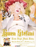
 In order to produce our magazine advert, we firstly started off with the main background. We used the same image of our singer as the DigiPak cover. We decided to do this as we think having the same image would keep the DigiPak and magazine advert consistent. However, unlike our DigiPak cover, we chose to keep the image on the magazine advert in colour. We then played around with the effects of the image and decided that the chosen effect looked best. This was the brush strokes tool which makes the image look slightly cartoon like. This links back with our initial advert research as we found that Gwen Stefani, also in the Pop Rock genre, used a similar effect on the advert for her album 'Love. Angel. Music. Baby.' where the main image is slightly blurred and looks cartoon like.
 In order to create the artist's name 'P!NK" we used the basic text tool and changed the font to Impact to keep the font consistent with our DigiPak. We then played around the colours of the text and found that having the text in pink would make the advert too over powering with the colour of pink. Therefore, we changed the text to white and added a ink outline by using the stroke tool. We also used the bevel and emboss tool in order to make the text stand out and appeared slightly 3D.
We decided to have the album title 'Heartbreaker' running down the right hand side. This allowed us to fill the gap down the side as it was just background on the main image. Again, we used bevel and emboss in order to make the text stand out. We also used the stroke tool again to create a pink outline on the black text.
We added the infomation at the bottom by using the basic text tool. We chose to use the colour pink for this writing as black or white text wouldn't stand out as much on the image as her coat is black and white. We decide to again have a black outline around the text to enhance the information. We changed the colour of the text "OUT NOW!" to white in order to help it stand out from the rest of the information. This is because this piece of infomation is more likely to catch people's eyes when they see the advert.
Finally, we incorporated our album cover we had created into the bottom right hand corner. This is because we found many artists do this on their magazine adverts and we thought it looked more professional. We wanted to include the album cover to link our product together and also give the audience more information on the product being advertised. We used the drop shadow tool on the image of our album cover to create darkness around the image to help it stand out more. Again, we used the bevel and emboss tool on the image to make it more prominant and stand out.
We think the overall product is eye catching and would be appealing to our target audience due to the colour scheme and the appearance of the advert. We also think that the advert is consistent with our music video and DigiPak due to themes such as the images used, the font and the colour pink.

No comments:
Post a Comment